Highcharts: higlighting the X axis on plot bands
Currently we are using highcharts.js for a client for whom we built monitor dashboards. One of the requirements was to highlight the axis every time that a plot band was displayed.
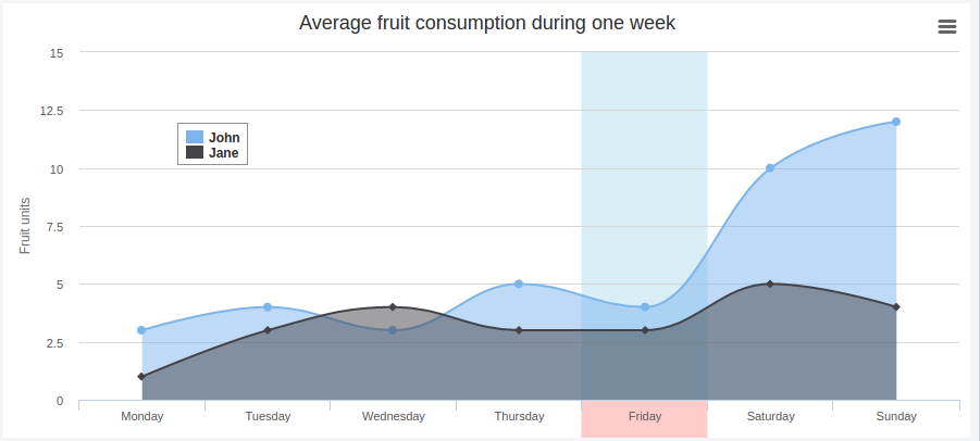
The issue here is that the axis are outside the plotting area. The solution that we found is to use the Highcharts drawing library in order to draw a rectangle over the axis and just at the bottom of the plot bands. To achieve this we had to dive into in how the band was drawn with svg.
Every plot band is a
[cc lang=”html” width=”100%”]
As I told you the solution was to draw a rectangle (rect in svg) rightat the bottom of that path element and over the axis. A rect tag is simpler because it takes as parameter the x, y coordinate of the top-left corner and a height and width values.
For that we created a javascript function that parses the d attribute and use the load event of the chart to draw the rectangle.
I don’t want to enter in high technical details about how the d attribute works so I will give you the next fiddle for you to see the code working:
Highcharts highlighting the X axis on plot bands
And that is.
Farewell and good Hacking.