
Chakra-UI vs Material-UI vs Tailwindcss for ReactJs
In our team, we had to confront the decision of adopting a UI library for a new project and working styling, React can be very easily if we choose the correct tool for the right project, but it can turn in waste of time and resources if we not do it well. This article is oriented to be a little help taking this decision if you want to get out of the classic tools like bootstrap
With the wide variety of libraries nowadays, let’s try to use a general classification to get a better context:
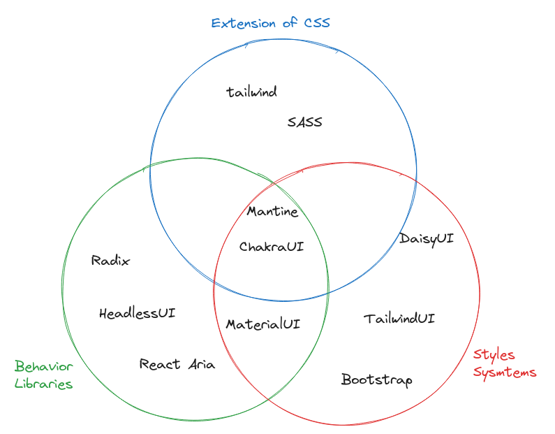
- Extension of CSS: uses for better and faster ways to write CSS, for example SASS, LESS, Tailwind
- Styles systems: Focused on writing better code close to a components systems to be applied on top of the DOM, defining how the components looks. For example: tailwind UI, Bootstrap
- Behavior libraries :Focused on the component’s behavior, adding the control with JavaScript. For example: HeadlessUI, Radix, React Aria
Material-UI
MUI is a React component systems based on the Google’s material design. It can be considered like the new version of bootstrap
Material is considered to have a slightly steep curve if the due to its extensive components library and theming system if the main focus is to master their use, but it is easy to learn for beginners cause it provides a structured and opinionated approach
Being MUI one of the most popular libraries in the present, there are big number of documentation, guides and is very active on stack overflow community under [material-ui] tag.
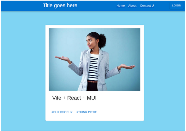
- Components example:
<ThemeProvider theme={defaultTheme}>
  <CssBaseline />
  <AppBar position="relative">
    <Toolbar
      component="nav"
      variant="dense"
      sx={{
        justifyContent: "space-between",
        overflowX: "auto",
      }}
    >
      <Typography
        component="h2"
        variant="h5"
        color="inherit"
        align="center"
        noWrap
        sx={{ flex: 1 }}
      >
        Title goes here
      </Typography>
      {["Home", "About", "Contact U"].map((section) => (
        <Link
          color="inherit"
          noWrap
          variant="body2"
          sx={{ p: 1, flexShrink: 0 }}
        >
          {section}
        </Link>
      ))}
      <Button size="small" variant="contained" sx={{ ml: 8 }}>
        Login
      </Button>
    </Toolbar>
  </AppBar>
  <main>
    <Container
      sx={{ py: 8, width: "100vw", height: "100vh", background:"#85d5f5" }}
      maxWidth="md"
    >
      <Card
        sx={{
          maxWidth: 450,
          height:"auto",
          margin: "0 auto",
          padding: "1em",
          display: "flex",
          flexDirection: "column",
        }}
      >
        <CardMedia
          component="img"
          alt={"alt"}
          sx={{
            objectFit: "contain",
          }}
          image="/img/stock-photo.jpg"
        />
        <CardContent sx={{ flexGrow: 1 }}>
          <Typography gutterBottom variant="h5" component="h2">
            Vite + React + MUI
          </Typography>
        </CardContent>
        <CardActions>
          <Button size="small">#philosophy</Button>
          <Button size="small">#think piece</Button>
        </CardActions>
      </Card>
    </Container>
  </main>
</ThemeProvider>
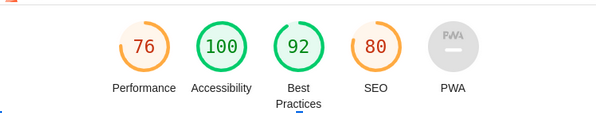
- Lighthouse analysis
Chakra-UI
It’s a simple, modular and accessible component library that gives you the building blocks you need.
The props declaration and prop names are very intuitive and easy to learn. It has a component system with almost 30 elements easy learned. The way it has the components names and props make it very easy to read. Also, it has a very simple way of writing.
Chakra-UI has almost 480,900 weekly downloads and not that big but strong discord community about 9100 users, nothing bad for a library released 3 years ago
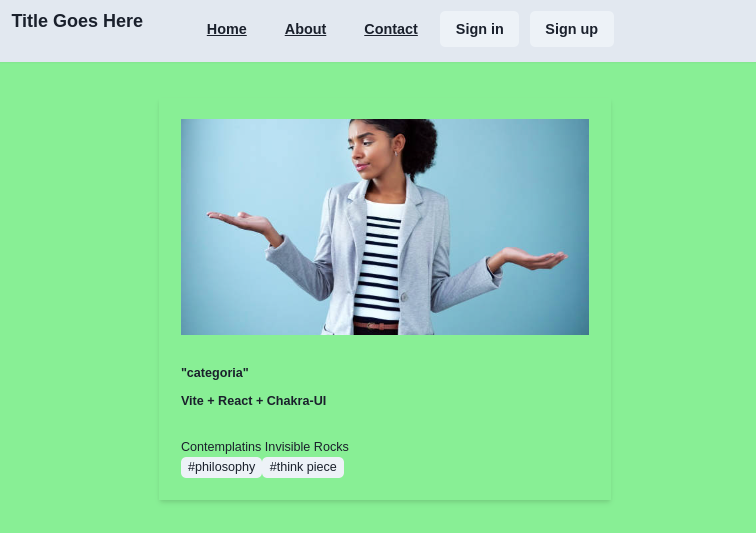
- Chakra-IU code example
<ChakraProvider>
      <Box minH="100vh" w="100vw" bg="lightgreen">
        <Box as="section" pb={{ base: "12", md: "24" }}>
          <Box as="nav" bg="gray.200" boxShadow="sm">
            <Container py={{ base: "4", lg: "5" }} ml="0 !important">
              <HStack spacing="" justify="space-between">
                <Flex justify="space-between" flex="1">
                  <Heading size="md" minW="200px"> Title Goes Here</Heading>
                  <ButtonGroup
                    variant="text"
                    colorScheme="gray"
                    mr="2"
                  >
                    {["Home", "About", "Contact"].map((item) => (
                      <Button key={item} textDecor="underline">
                        {item}
                      </Button>
                    ))}
                  </ButtonGroup>
                  <HStack spacing="3">
                    <Button>Sign in</Button>
                    <Button>Sign up</Button>
                  </HStack>
                </Flex>
              </HStack>
            </Container>
          </Box>
          <Container mt={10}>
            <Link key="1" _hover={{ textDecor: "none" }} role="group">
              <Box
                p="6"
                bg="bg.surface"
                boxShadow="md"
                _groupHover={{ boxShadow: "xl" }}
                transition="all 0.2s"
                height="full"
              >
                <Stack
                  spacing={{ base: "8", lg: "16" }}
                  justify="space-between"
                  height="full"
                >
                  <Stack spacing="8">
                    <Box overflow="hidden">
                      <Image
                        src="/img/stock-photo.jpg"
                        alt="/img/stock-photo.jpg"
                        width="full"
                        height="15rem"
                        objectFit="cover"
                      />
                    </Box>
                    <Stack spacing="3">
                      <Text fontSize="sm" fontWeight="semibold" color="accent">
                        "categoria"
                      </Text>
                      <Heading size="xs">Vite + React + Chakra-UI</Heading>
                    </Stack>
                  </Stack>
                  <HStack>
                    <Box fontSize="sm">
                      <Text fontWeight="medium">
                        Contemplatins Invisible Rocks
                      </Text>
                      <Tag>#philosophy</Tag>
                      <Tag>#think piece</Tag>{" "}
                    </Box>
                  </HStack>
                </Stack>
              </Box>
            </Link>
          </Container>
        </Box>
      </Box>
    </ChakraProvider>
- Lighthouse analysis

TailwindCss
Tailwind CSS is an open-source utility-first CSS framework designed to help developers effortlessly build user interfaces.
It’s very easy to learn it if you have a bootstrap background, but if you came from `styled-components` or `emotion`, it may take a more time to master it. Once you have learned the props names, the code writing became one of the fastest and simplest ways to style components.
Also, tailwind has a very strong and big community on discord where you can reach quickly for help, with about 31,000 users.
One important point to remark is the bundle size, combined with minification and network compression, its usually leads to CSS files that be less than 10kB, even for large projects. For example, Netflix uses Tailwind for Netflix Top 10 and the entire website delivers only 6.5 Kb of CSS over the network
- Code example
<section className="p-6">
      <h2 className="text-2xl font-light text-gray-900 leading-none mb-6">Home</h2>
      <h1>Vite + React + Tailwind</h1>
      <div className="my-6">
        {showVertical && (
          <div className="card state-1 max-w-sm rounded overflow-hidden shadow-lg" onClick={() => setShowHorizontal(true)}>
            <img className="w-full" src="/img/stock-photo.jpg" alt="Woman of color weighing all options." />
            <div className="px-6 py-4">
              <h3 className="text-gray-900 font-bold text-xl mb-2">Contemplating Invisible Rocks</h3>
              <span className="inline-block bg-gray-200 rounded-full px-3 py-1 text-sm font-semibold text-gray-700 mr-2">#philosophy</span>
              <span className="inline-block bg-gray-200 rounded-full px-3 py-1 text-sm font-semibold text-gray-700">#think piece</span>
            </div>
          </div>
        )}
        <CSSTransition
          in={showHorizontal}
          timeout={350}
          unmountOnExit
          onEnter={() => setShowVertical(false)}
          onExited={() => setShowVertical(true)}
        >
          <div className="card state-2 max-w-sm w-full lg:max-w-full lg:flex" variant="primary" onClick={() => setShowHorizontal(false)}>
            <div className="h-48 lg:h-auto lg:w-48 flex-none bg-cover rounded-t lg:rounded-t-none lg:rounded-l text-center overflow-hidden" style={{ backgroundImage: "url(" + "/img/stock-photo.jpg" + ")" }} title="Woman holding a mug">
            </div>
            <div className="border-r border-b border-l border-gray-400 lg:border-l-0 lg:border-t lg:border-gray-400 bg-white rounded-b lg:rounded-b-none lg:rounded-r p-4 flex flex-col justify-between leading-normal">
              <div className="mb-2">
                <h3 className="text-gray-900 font-bold text-xl mb-2">Contemplating Invisible Rocks</h3>
                <p className="text-gray-700 text-base">Lorem ipsum dolor sit amet, consectetur adipisicing elit. Voluptatibus quia, nulla! Maiores et perferendis eaque, exercitationem praesentium nihil.</p>
                <div className="py-4">
                  <span className="inline-block bg-gray-200 rounded-full px-3 py-1 text-sm font-semibold text-gray-700 mr-2">#philosophy</span>
                  <span className="inline-block bg-gray-200 rounded-full px-3 py-1 text-sm font-semibold text-gray-700">#think piece</span>
                </div>
              </div>
              <div className="flex items-center">
                <img className="w-10 h-10 rounded-full mr-4" src="/img/stock-photo.jpg" alt="Woman of color weighing all options." />
                <div className="text-sm">
                  <p className="text-gray-900 leading-none">Testing CSS Transitions</p>
                  <p className="text-gray-600">Aug 18</p>
                </div>
              </div>
            </div>
          </div>
        </CSSTransition>
      </div>
    </section>
Netflix Top 10
- Lighthouse analysis

In a nutshell
- Do you want a fresh, very well document, with a lot of code examples with more than 100 predefined components to launch big projects in a very fast way a and very active community for big projects ? You can choose Material-UI
- If you want to get fast and very easily custom styles for small and medium projects ? We can choose Chakra-UI. But if we don’t use the most of the components from the library, we are installing a lot of JS that we are not using.
- Or if you want to own the total control of your components styles systems writing from scratch your CSS for big projects with, it may be a good choose Tailwind-UI. Coding with Tailwindcss styles? It may help us to think coding in a way closer to the browser logic also y compatible with every framework